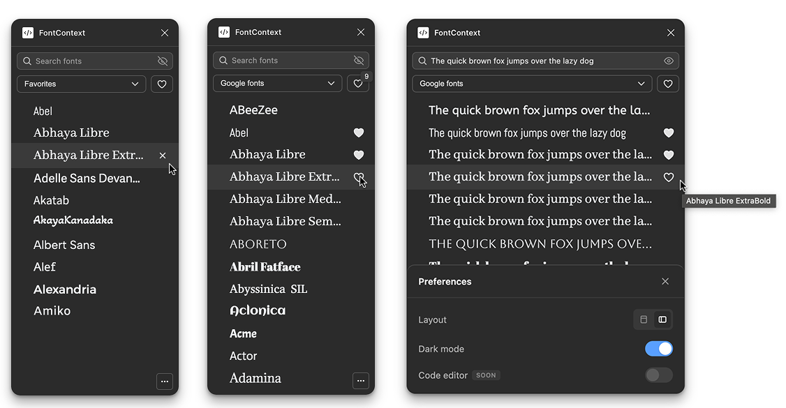
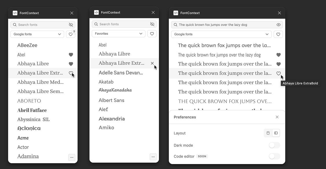
Heart Placement
First version had hearts on the left of each font row. I watched four people use it. Three of them overshot, aimed for the heart, clicked the font name by accident, triggered the font preview when they meant to favorite. One person hesitated before every click, cursor hovering, recalculating.
If clicking feels risky, people hesitate.
I moved hearts to the right edge. Exactly where every social app puts the like button. Muscle memory solved the problem. I tested again with three people. Nobody misclicked. Nobody hesitated.
Hover Timing
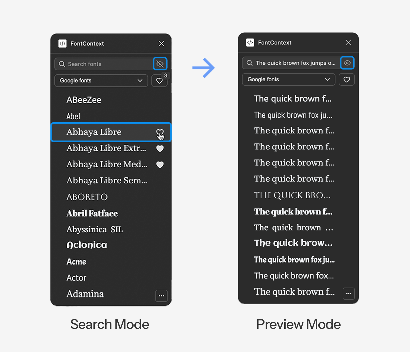
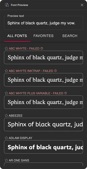
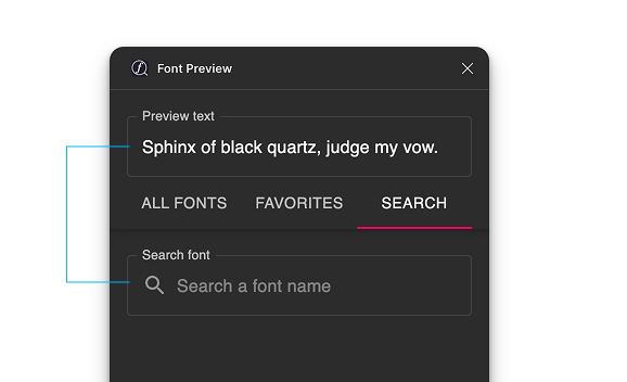
Preview mode shows your text instead of font names. So how do you know what font you're looking at?
I added a tooltip that shows the font name on hover. But what's the right delay?
I tested three timings:
- 200ms felt sluggish. You hover, wait, then the name appears. Felt unresponsive.
- 100ms triggered accidentally while scrolling. Your cursor passes over rows and tooltips pop up everywhere. Chaotic.
- 120ms was the sweet spot. Fast enough to feel immediate. Slow enough to not trigger by accident.
Real Time Badge
When you favorite a font, the badge count updates instantly. 10 becomes 11 as you click. Facts.
I tested without this first. The count only updated when you switched tabs or reopened the plugin. I watched two people click the heart multiple times because they weren't sure if it worked. "Did that register? Should I click again?"
This is about trust. Users need to know their action registered. If there's doubt, there's hesitation. Instant feedback closes the loop. The system feels alive, responsive, trustworthy.
Toast Annotation
Preview mode created a problem: when rows show "Hello World" instead of "Playfair Display," you lose the font name.
I solved a problem my own feature created.
Hover reveals the name as a toast annotation above the row. Not a tooltip below, that would cover the next row. Above, so it floats without blocking anything.
Layout Toggle
A student was designing a wedding invitation. Long headline: "Together with their families, Sarah & Michael request the pleasure of your company at their wedding celebration."
Opened FontContext. The text clipped in list view. Cut off mid-sentence. She couldn't see how the full phrase looked.
I added horizontal grid layout, full width cards where text never cuts off, no matter how long. Toggle between list (compact, more fonts visible) and grid (full context, nothing hidden).
Different designers work differently. The tool adapts.
Dark Mode
A student asked: "Does this work in dark mode?"
It didn't. The plugin was white, Figma's interface was dark. Visual clash. Felt like a foreign object in the workspace.
I added theme detection that matches Figma's interface setting. Light or dark, FontContext blends in. Feels native.
Scroll has to feel instant or users won't trust it.
The preview engine worked, but it stuttered. Scroll fast and fonts popped in with visible lag. Half second delays. Text flickering. Janky.
Users anchor on first impressions. If the tool feels slow on first scroll, they won't trust it. The native dropdown is blind, but at least it's instant.
I tested the stuttering version with three people. All three said some version of "it's slow" or "it lags" within the first ten seconds. That's all it takes. Ten seconds to lose trust.
I rewrote the rendering engine twice.
Performance Architecture Evolution
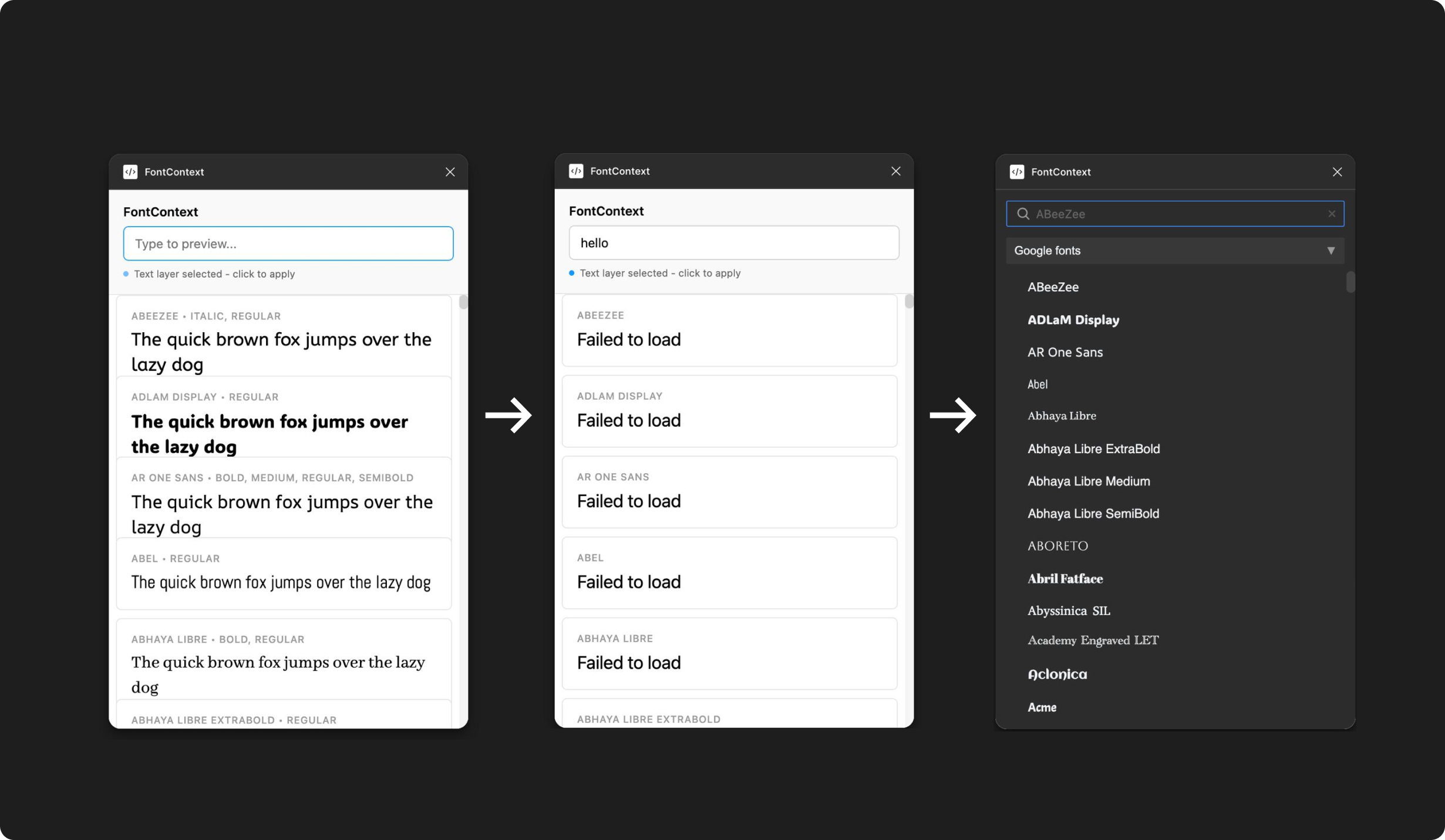
First Attempt: Load Everything Upfront
Load all 1,400+ Google Fonts on launch. Get everything ready upfront. Memory spiked to 400MB. Chrome tabs started crashing. My laptop fans screamed. Unusable.
Second Attempt: Lazy Loading
Load fonts as they scroll into view. Better, memory stayed reasonable. But every font triggered a separate network request. Scroll fast, fire a hundred requests at once, get rate limited by Google's API. Fonts would just stop loading. Error states everywhere. Still broken.
Final Version: Virtual Scrolling
The DOM only renders fifteen font rows at a time, the ones currently visible in the viewport plus a few above and below as buffer. As you scroll, rows outside the viewport get destroyed and new ones render in their place.
CDN Injection
Fonts load from the CDN just before entering the viewport, then cache locally in the browser. Memory stays under 50MB. Scrolling feels instant. No lag. No flicker. No rate limits.
I spent more time on scroll performance than any single feature. That's the cost of entry. You can't ship something that stutters and expect people to trust it.